If we’ve been part of the writing community for a while, we’ve probably come across some basic advice about cover design. Those of us who get a say into our covers—either because our publishers listen to us or because we self-publish—might have even paid attention to some of those tips. *grin*
But as with most aspects of writing, there’s always more to learn. I’ve talked before about finding cover artists and my struggle to find diverse cover art. The latter is something both I and the author of today’s guest post have in common.
Another thing we have in common is a pet peeve for an issue found in celebrity magazines all the time, and yet authors are far too likely to make the same mistake on our covers. To address that and other cover issues, author and artist Renee Wittman is here today to share a few tips about cover design—including some insights we might not have thought of before.
Please welcome Renee Wittman! *smile*
*****
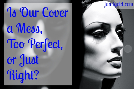
How Can We Make Our Cover Perfect
(But Not Too Perfect)?
by Renee Wittman
We all love covers, right? The right cover catches your eye, draws you in, and hopefully prompts a sale. As an author, a cover is your first and best chance to draw attention to your book.
At the same time, covers are so very easy to botch and drive readers off instead, hindering sales. You want to stand out in a crowd, but your cover creates expectations of what the reader can look forward to.
If you fail to meet those expectations, you may lose a purchase—or worse. If they’re feeling snotty, they may give you a bad review.
If you’re a traditionally-published author, you may have very little influence in what type of cover you’ll have, and that’s unfortunate. If you have a good agent, sometimes changes can be made, sometimes not.
If you self-publish, that cover is all on you.
4 Things to Consider with Cover Design
Here are a few things you should consider when you make your cover:
Issue #1: Genre Impression
The first hurdle is genre. Every author wants their book to stand out with a fresh cover, but readers glancing at that cover want to be able to easily tell what genre your book is. A Cozy Mystery is an entirely different look than an Urban Fantasy.
For the first, readers expect a sweet, painted illustration with an image hinting at the main character’s career or hobbies, possibly with a cat or other pet. In the second, readers would expect a cover made from stock photos with a plucky protagonist, possibly surrounded by men (or animals if Paranormal Romance) and often with brilliant colors.
When you’re creating your cover, search Amazon for other books in your genre.
- See what color combinations are popular. A thriller might miss out on sales if it’s in soft pastels.
- You also want a fair amount of contrast in your cover. I don’t know about you lovelies, but I read everything on a black and white Kindle. Some covers are indecipherable in grayscale.
Issue #2: Thumbnail Clarity
The first draws the eye, but you need to keep in mind that your covers will be seen as thumbnails on Amazon and most other websites.
Is your cover too busy? Too many characters all in the same cover can look busy and present no clear focal point. Too much detail in the background can overpower your characters and distract from your protagonist.
What type of font did you choose? You want it to match the genre, sure, but also…
- It’s more important to make it easily readable with no embarrassing misreads. If someone is reading your cover for ‘The Demon King’ in cursive, and they misread it as ‘The Lemon King’ and happily click on it — they may not be your ideal reader.
- Is your title too long? It shouldn’t be filling all of your space on the cover, as a general rule.
- The font needs to contrast with the background as well so it’s easily readable on a smaller scale and in grayscale.
You often have a split second to make that first impression on your readers when they glance at your thumbnail.
Issue #3: Stock Art Choices
The next issue may be a stock art issue as much as it may be a poor choice on the author’s part.
Does the cover art look like your protagonist? If your leading lady is a heavily-muscled Asian biker, a waif of a white girl in a ballgown is probably not the best choice. If she wouldn’t be caught dead in anything but jeans and a tank top, but she’s sexily posed and wearing a dress on the cover, this can put off readers.
Think you've heard all the cover-design advice before? Check out these unique tips by @ReneeWittmanYA! Click To TweetUnfortunately, there is an abundance of skinny-white-woman-in-a-ballgown-posing-angstily stock photos and very few stock photos with people of color or people of varied body types. Even more frustrating, many of the photos are offensively stereotyped.
This can make it hard to find a good fit for your protagonist and may offend readers. With a lot of the “ethnic” stock photography, I can’t tell if it’s actually a style or just something the photographer thought up after a few stiff drinks while searching Amazon for costume parts.
This is one place where we can vote with our money. If a subset of stock photos sells well, then it creates demand for photographers to take more of those photos.
Issue #4: Over-Processing Images
The cover issue that bothers me the most, though, has to do with over-processing the model. We are not made of plastic. We all have pores and imperfections in our skin, and I see way too many covers where the model is so unrealistically air-brushed and perfect that it catches the eye — and not in a good way.
Photo editing can be a wonderful tool, tying together different poses, clothes, backgrounds, and lighting into something lovely. This is great for saving money if you have the skills yourself.
But it’s so, so easy to overwork an image.
If you aren’t an artist and are struggling to make your own cover, you may not know how to achieve the effects you want. One example that stands out to me that I see frequently is stubble.
Don't miss these 4 unique tips on book cover design from @ReneeWittmanYA Click To TweetIf you want your male characters to have stubble, you might be tempted to just do a transparent gray over part of their face. This… does not look realistic at all, and if it’s done over a photo, it looks awful. It may be an area where you need to do more research or possibly hire an artist. Solid washes of color are really ideal for cartoon or comic styles, something that’s not meant to appear lifelike.
Have someone proof your image, preferably several someones. We all laugh at editing goofs in magazine images: extra hands, too thin of a waist or thighs, things that make the image ridiculous.
Oops, forgot to erase a hand! How many fingers did we need again?
It’s silly, but there’s such a push for perfection that we are all tempted to touch up that image, just a little. Having a second eye on your image can help prevent mishaps.
I know a lot of people are using these art programs for the first time, trying to save some money, but the artist in me wails and throws up her hands in dismay. Part of becoming a better artist for me was learning to add texture to make things more realistic. This might be why it’s a pet peeve of mine.
Final Thoughts
Remember, your main characters don’t need to look perfect.
Instead, it’s important for your main character to be appealing on the cover, however you define that. They also need to match your genre, shrink well, and look like your protagonist.
A clumsy cover isn’t a deal breaker for me, because I know we’ve all been there. If you don’t have the budget, it isn’t in the cards. I get that, but keep these suggestions in mind when you’re planning out your cover. I want it to be the best you can make it… and hopefully enough to catch my eye when I’m scrolling by. *wink*
*****
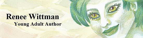
Renee Wittman writes clean and sweet Young Adult Urban Fantasy (that’s a mouthful!) and loves writing about strong friendships, unconventional romances, and all things magical.
She loves watercolor painting, reading, writing, and gardening. (Only things she can eat though, because roses aren’t tasty.) She lives with her husband and a spoiled rotten malamute in a not-quite-tiny house in the Rivers and Bluffs area of Southwest Wisconsin.
Find Renee at:
Website/Blog | Newsletter Updates | Facebook | Twitter
*****
Thank you, Renee! In addition to your point about our mutual pet peeve of plastic-looking people in media, I loved your tip about contrast, especially with grayscale. That’s something I’ve always checked about my covers, but that cover-advice articles don’t always mention.
As Renee said, contrast is important, both with our overall cover image and with our font. On my Kindle with thousands of books in my to-be-read pile, I often scroll through through various library collections to decide what to read next.
If I can’t decipher what the book is from the teeny-tiny thumbnail in my grayscaled Kindle library, I’m less likely to remember what I downloaded and ever read the story. As a result, that’s a review or gushing mention that won’t happen.
Of course, I really appreciated Renee’s insight into how the people on our cover images can be overprocessed and not realistic looking. If that is the impression we want, no problem.
(For my book Treasured Claim, the heroine isn’t human, so the luminescent quality of her skin is perfect for the character, a dragonshifter with rainbow-shimmering microscopic scales. Ditto for the flawless-but-goth faerie heroine of Ironclad Devotion. Those images do match the characters.)
But it’s so easy to try to make our characters match the style of fashion or celebrity magazine covers. As a society, we often complain about how those images create unrealistic expectations for life and normal human appearance, so we don’t want to be guilty of the same issue on our covers.
No matter our genre or story, we want to attract the right readers to try our book. And that process starts by creating the right impression with our cover. *smile*
Have you seen books with any of these issues before? Can you think of any other unusual tips to add to this list? Have you complained about the overly airbrushed cover models on magazines? Had you noticed that book covers can fall into the same trap? Do you have any questions for Renee?