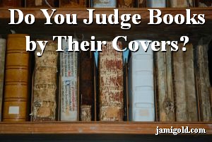
I’ll admit it. I do judge books by their covers, especially in this age of self-publishing.
If authors don’t care about the quality of their book cover, it’s easy to assume they also didn’t care about the quality of their writing. Besides, we all have too many reading choices now, and just like agents and editors, we’re often looking for a reason to say “no.” Every “no” judgment we make means one less book added to our towering to-be-read pile.
Does a good cover guarantee good writing? Absolutely not. But we won’t pick up a book from a shelf or click to read more—allowing us to discover the writing quality one way or another—unless the cover entices us.
What Does a Bad Book Cover Say about the Author?
If we compare picking a book to buying a house (yes, completely different price ranges, but go with me here), we first narrow down by city, or in the case of books, genre. A neighborhood is like the subgenre, deciding between a historical romance or a paranormal romance, this neighborhood’s schools or that neighborhood’s shopping. Continuing the analogy, a book cover is the “curb appeal” that makes people willing to look inside rather than deciding to drive past the For Sale sign.
Yes, that thinking can be shallow or lead to missing out on a great undiscovered gem. But just as home owners know they’ll be judged on their curb appeal, authors know they’ll be judged by their cover.
So those who choose to put something unattractive up for sale are saying something about their judgment and priorities. And just as we might assume a house without curb appeal might not be well maintained on the inside, we are often justified in making similar assumptions about books.
The Sad Fact: In Most Cases, It’s Fair to Make Assumptions
That said, most traditionally published authors don’t have any control over their book covers. However, they did have control over which publisher they chose for their story. I can think of one publisher I’d never sign with because all their covers are crap. Another small publisher is seeing huge success, partly because many of their covers are gorgeous.
Self-published authors have control over their covers, but might struggle with budgeting. We sympathize. However, if they didn’t save up for a nice cover, maybe that means they didn’t save up to pay for an editor either.
In either case, traditionally published or self-published, the cover does reflect something about the author. At the very least, we learn about their priorities.
How Can We Learn What Covers “Work”?
Because of this importance of book covers, I love the idea of the “Judge a Book by Its Cover” contest (known as the JABBIC contest) sponsored by the Houston Bay Area chapter of RWA. Published romance authors are judged solely by their book cover.
As readers and authors, we can learn a lot about ourselves and the market from this contest too. JABBIC has a Reader’s Choice opportunity for everyone to rate the entries.
I spent a few minutes this past weekend adding my ratings to the entries, and I noticed several things about what can make a cover look “good” or “bad” to me. (Full disclosure: I’m not a designer, but I still can have opinions. *smile*) I’d recommend checking out these covers to see what works or doesn’t work for you, especially if you write romance (note that the contest, and possibly this link, will close on February 10th).
What We Can Learn from Looking at Book Covers
While going through the entries, I stopped and asked myself why I assigned a certain score. Why did I like it? Or why didn’t I like it? Some of the things I noted include:
- Genre: Some covers evoke the genre and some don’t. The new trend for romance covers to have a simple object on a single color background (blame Fifty Shades of Grey) might get old fast because it doesn’t succeed in this respect. However, if only erotic romance uses this technique (generally to enable purchasing for Costco or whatnot), this might become the new shorthand for the erotic romance genre.
- Cluttered Text: Covers can have too much information: blurb, “Sale,” “New,” “Bestselling Author,” “Book Two in X Series,” publisher name, publisher imprint, etc. Balance is key.
- Cluttered Images: Some covers have too many images mashed together. A busy background takes away from the power of the title. Images with no commonality can give the impression that the story will be similarly chaotic.
- Confusing Images: Sometimes we can’t even tell what the images are supposed to be. Or the images can seem to have nothing to do with the story. Just like in our writing, enticing is good, confusion is bad.
- Font: Some people have an unhealthy love affair with Comic Sans. Others use unreadable fonts. Readers shouldn’t have to struggle to read the title. I’m a visual person with a photographic memory. If I can’t easily read the title, I won’t remember it.
- Tagline: On some of the entries, the tagline created interest from an otherwise bland cover. I’m filing this tidbit under “Ooo, I need to remember that technique.” *smile*
- Self-Published “Look”: What makes a cover look cheap or self-published to you? Bad PhotoShop? Cheesy fonts? Odd colors? Stock photographs? All of the above?
- Publisher: Pay attention to the publisher of the covers we like or don’t like. Start a “yes” and “no” list of publishers that impress us.
After we put this knowledge together, we’ll have an idea of what we like and what we don’t. For those who self-publish, becoming aware of our tastes and “what not to do” can help us develop covers we’ll be proud of. For those who traditionally publish, we’ll be better able to evaluate publishers for their ability to deliver a great cover.
We can continue this evaluation by checking out our genre at Amazon. Maybe even gain insight by analyzing how covers correlate with sales figures. At least with a great cover, we know we won’t be turning potential readers off before they even get a chance to see our brilliant writing inside. *grin*
Do you think it’s fair to judge books by their covers? Do you judge books that way? What aspects make you like or dislike a cover? What makes a cover look self-published to you? Are there publishers you would or wouldn’t want to sign with because of their covers?