Today’s post is the unofficial “part three” of the results from my poll. I hadn’t planned this post, but the comments from last time inspired a new thought.
In part one, we talked about how to help your blog readers find you. And in part two, we discussed the things that turn people off from visiting blogs. Down in the comments of part two, we got into another great conversation of even more pet peeves when it comes to websites. (I love my blog readers!) But one comment in particular got me thinking…
One of my Twitter friends, Anthony Reese, made this comment:
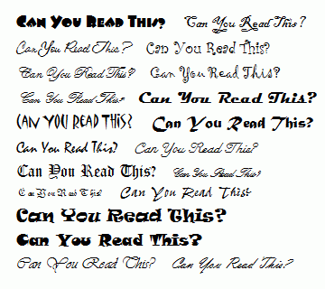
My biggest pet peeve (and one I just saw today) is when blogs have crazy type-faces. I hate when I have to decipher the font just to be able to read the content. There is nothing in the world wrong with Arial or Times New or Helvetica. It’s as if some people think an interesting font makes their blog more interesting. Not quite!
And he’s absolutely right. It’s silly to use fonts that are difficult to read. We shouldn’t make the letters on our blogs do crazy acrobatic tricks to get attention from readers. Do we want people to focus on our scripty-scrolly-swirly-whirly letters and our don’t-these-drips-look-like-blood letters? Or do we want people to focus on our writing, our words, and our point?
Can You Read This?
 This is hard for me because I love fonts. I love how different fonts evoke different feelings. I have over one-hundred fonts on my computer, and that’s with me cutting myself off about a decade ago from acquiring more. Just imagine how many I’d have if I’d continued collecting them.
But non-basic fonts take away from our writing. They call attention to the letters instead of the words. They distract from our point.
Does this sound like something we’ve heard before? Yep.
Focus on the Writing—In Blogs, Query Letters, or Both?
Agents tell us all the time to stick to Times New Roman with our query letters. Why? Because they assume if you use some fancy typeface, scented envelopes, or pink-glittery paper, you must be trying to compensate for less than brilliant writing. Ouch.
Could the same be true for our blogs? Could fancy typefaces do even more damage than just making things hard to read? Quite possibly.
We’ve already mentioned how too much bling with widgets and bells and whistles can make a blog look less professional. And aren’t look-at-me typefaces a type of bling? Basic fonts might be boring, but at least they don’t make people think you’re compensating for some deficiency with your writing.
But unlike query letters, our blog or website is our online home. So how can we let our personality shine while still keeping things legible and professional? I say, use a font that reflects your personality or brand—but only in the banner at the top of the page. Keep your content clean and easy-to-read with a basic font.
Gee, now that I look at my website, I see I did this with my design. *whew* I’m glad my subconscious knew what the heck it was doing. *pats muse on the head* Good boy.
It’s no longer uncommon for an agent to check our blog when they’re potentially interested in our work. While our website might not be the final push they need to want to work with us, an unprofessional-looking site could certainly convince them not to follow up on their interest. Every element of our blog adds up to an impression. What impression are you giving your visitors?
How professional do you keep your blog? How do you balance that with your personality and brand? Do you use bling? How much and why?

